

Why Your Website Traffic Is High But Sales Are Flat: The Hidden UX Fixes You Need
Experiencing healthy website traffic but no sales is one of the most frustrating dilemmas for modern business owners. Marketing campaigns generate interest, analytics charts trend upward, and potential buyers arrive daily, yet transaction logs remain quiet. When acquisition channels work as intended but revenue fails to follow, the breakdown rarely stems from brand interest; it points directly to friction within the user journey.
Web development and user experience (UX) architecture determine whether curious visitors transition into paying customers. Subtle interface missteps, mismatched expectations, and cognitive overload create silent conversion barriers. Understanding these hidden friction points enables businesses to transform passive audience visits into predictable commercial outcomes without needing to double advertising budgets.
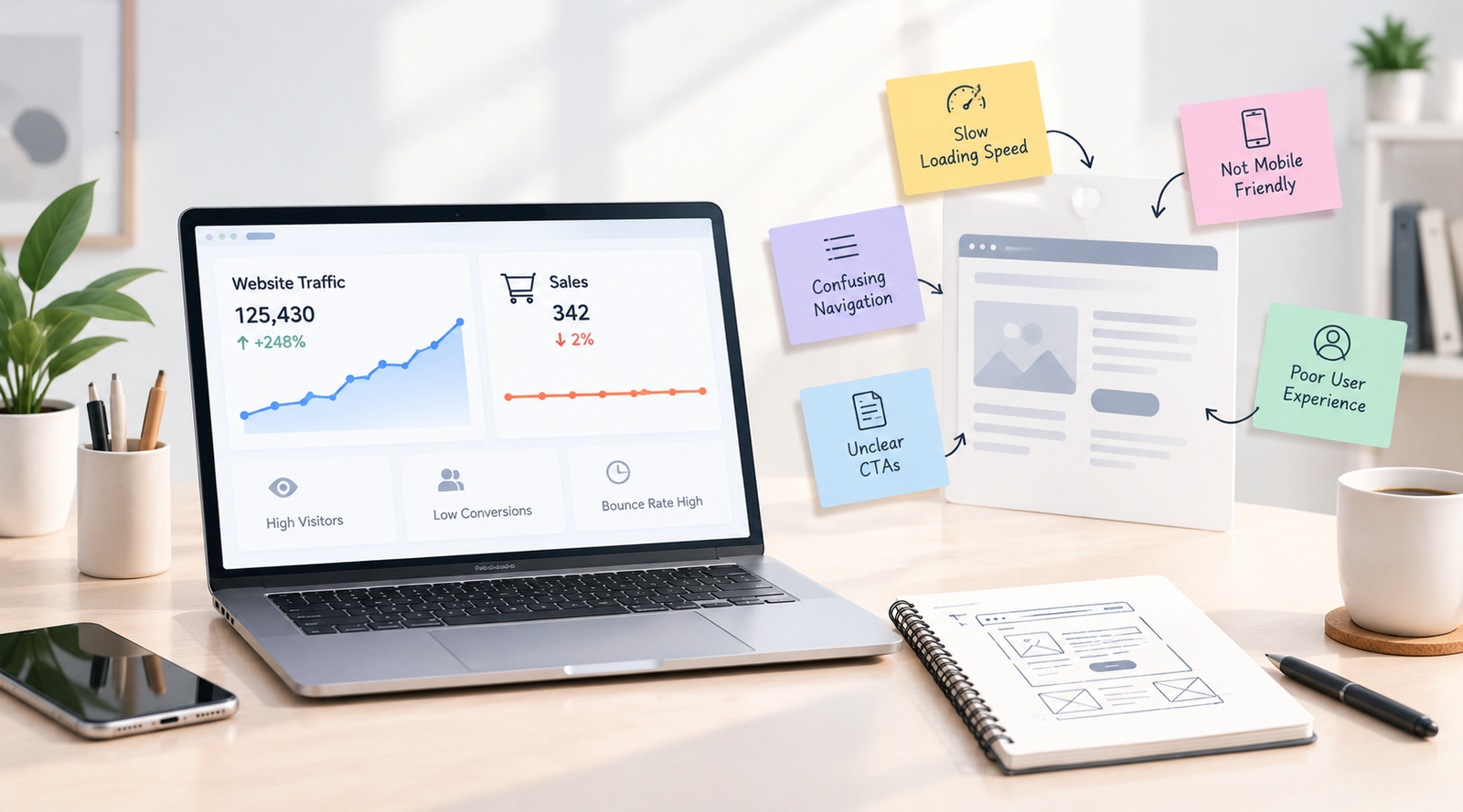
When website traffic is high but sales remain flat, the disconnect is typically caused by post-click friction: confusing visual hierarchy, cognitive strain during checkout, weak value propositions, or sluggish interface performance. Resolving these UX roadblocks through deliberate page layouts, transparent customer journeys, and clear transactional cues bridges the gap between casual visits and confirmed purchases.
Table of Contents
- Understanding the Disconnect Between Visits and Conversions
- Why You Have Website Traffic but No Sales
- Hidden UX Flaws Damaging Your Conversion Funnel
- Essential UX Fixes That Revive Stagnant Sales
- UX Friction Points vs Conversion-Focused Adjustments
- Aligning Web Development Architecture with User Intent
- Turning Browsing Visitors into Committed Buyers
Understanding the Disconnect Between Visits and Conversions
Website traffic functions as an invitation, not a completed transaction. A digital audience lands on your pages because external touchpoints—search engine listings, social campaigns, or referral links—promised an answer to an immediate problem. When users arrive, their evaluation process shifts instantly from discovery to validation.
Visitors continuously assess whether your platform feels safe, intuitive, and worth their financial investment. If a landing page feels visually disjointed or fails to confirm the promise made in search results, user confidence evaporates. The audience leaves not because they lack buying intent, but because the website introduces friction instead of clarity.
Modern consumers make rapid judgments about digital credibility. A minor miscalculation in typography, confusing button hierarchy, or an aggressive pop-up disrupts the natural flow of evaluation. Addressing this gap requires evaluating the entire digital experience from the perspective of an uncertain first-time visitor.
Why You Have Website Traffic but No Sales
Identifying why a website attracts visitors without generating transactions begins with assessing the alignment between inbound intent and on-page execution. Diagnosing this issue involves looking beyond raw session counters into functional behavioral bottlenecks.
- Intent Mismatch: Inbound marketing brings visitors seeking basic educational answers rather than commercial solutions, leading to brief visits without transactions.
- Unclear Value Proposition: Visitors fail to grasp what makes your product or service uniquely capable of solving their problem within moments of landing.
- Absence of Contextual Trust: Missing guarantees, ambiguous commercial details, and non-intuitive contact channels erode confidence before checkout begins.
- Disruptive Mobile Navigation: Interfaces optimized primarily for desktop screens break down when browsed on mobile handheld devices, blocking the final purchasing action.
When these hurdles compound, prospective buyers abandon the site in favor of competitors that offer simpler, frictionless browsing journeys. Removing these obstacles demands a systematic review of layout design and interactive development.
Hidden UX Flaws Damaging Your Conversion Funnel
Most conversion leaks are not obvious technical errors. Broken links and server crashes are easy to spot and repair. The far more damaging threats are subtle usability mistakes that frustrate users on an instinctual level without triggering formal software bugs.
Cognitive Fatigue and Visual Clutter
When a single page presents multiple competing banners, blinking badges, and conflicting calls-to-action, visitors experience cognitive overload. The human brain naturally favors intuitive choices. Presenting ten different choices at the same time causes analysis paralysis, prompting users to exit rather than untangle the layout.
Ambiguous Call-to-Action Hierarchy
Buttons that blend into surrounding backgrounds or use non-descriptive labels like “Click Here” or “Proceed” create hesitation. A visitor must know precisely what will happen after engaging with an element. Lack of visual prominence means primary commercial actions fade into the background noise of the interface.
Cumbersome Multi-Step Checkout Processes
Requiring mandatory account creation before showing total costs or demanding unnecessary form fields introduces major friction. Every single keystroke requested from a customer represents an opportunity for second thoughts and immediate cart abandonment.
Organizations experiencing these persistent usability bottlenecks often look to professional technical evaluation. Collaborating with specialized teams for conversion-focused web design allows brands to replace confusing layouts with streamlined, goal-oriented architectures that gently lead users toward checkout.
Essential UX Fixes That Revive Stagnant Sales
Resolving stagnant sales does not require completely rebuilding your digital presence from scratch. Targeted adjustments focused on user psychology, navigational clarity, and technical speed can systematically remove friction and restore commercial performance.
- Establish Immediate Above-the-Fold Relevance: Ensure the primary heading and supporting sentence confirm what the visitor searched for within the first viewport, removing ambiguity instantly.
- Simplify the Visual Path: Use generous whitespace, high-contrast button styling, and focused section blocks to guide the user’s eye naturally downward toward conversion points.
- Incorporate Reassurance Signals at Key Moments: Place security badges, clear return guidelines, straightforward shipping timelines, and authentic client reviews adjacent to action triggers.
- Streamline Conversion Forms: Reduce required input fields to the bare essentials necessary to complete the transaction or qualify the initial business lead.
- Optimize Real-Time Interactive Speed: Eliminate layout shifts and render-blocking scripts so that buttons respond immediately to touch and cursor interactions.
When addressing older codebases that struggle under accumulated design legacy, minor updates may not suffice. Businesses facing deep architectural constraints frequently rely on website rebuilding services to eliminate foundational friction and align their user interface directly with modern purchasing behaviors.
UX Friction Points vs Conversion-Focused Adjustments
Evaluating site architecture requires contrasting standard interface patterns with deliberate, conversion-oriented design adjustments. The table below outlines how common usability oversights can be systematically transformed into supportive shopping journeys.
Aligning Web Development Architecture with User Intent
Flawless user experience relies on clean web development practices. A visually pleasing interface built on poorly structured markup or bloated front-end assets produces subtle latency that quietly disrupts customer decisions. Every micro-second of delay creates an opportunity for a customer to reconsider their purchase.
Modern web development must prioritize responsive flexibility across different viewports, dynamic component handling, and intuitive interaction states. Form inputs must support autofill seamlessly, error validation should offer constructive guidance in real time rather than clearing entered data, and buttons must visually confirm when an order is processing.
Businesses that successfully solve these complex interface hurdles focus on uniting front-end software engineering directly with human behavioral psychology. Digifier Web Technologies LLP supports organizations in identifying hidden interface friction, engineering clean customer journeys, and crafting high-performance digital architectures that support reliable commercial growth.
Turning Browsing Visitors into Committed Buyers
Unlocking steady revenue from existing traffic is far more cost-effective than continually spending more on audience acquisition. When a platform suffers from strong website traffic but no sales, the solution lies in systematically removing the hidden obstacles that make buying difficult or uncertain.
By simplifying navigation menus, clarifying value propositions, and streamlining checkout funnels, you make decision-making effortless for your visitors. Aligning intuitive UX design with solid development turns your web presence from a passive brochure into an effective engine for consistent, sustainable business growth.
Relevant Hashtags
#WebsiteTraffic #ConversionRateOptimization #UserExperience #WebDevelopment #UXDesign